Introduction
The evolution of web design
Web design has undergone a remarkable transformation over the years, moving far beyond the rudimentary, text-heavy pages of the early internet. In their infancy, websites were often purely functional, with limited attention given to aesthetics or user experience. These early sites typically featured simple layouts, basic color schemes, and minimal interactivity. However, as technology advanced and the internet became an integral part of daily life, the demand for more visually appealing and engaging websites grew. This evolution has led to the creation of dynamic and interactive platforms that not only meet but exceed user expectations. Modern web design now incorporates a wide array of elements—such as animations, multimedia content, and intuitive navigation—all designed to create an immersive user experience. At the heart of this evolution is the strategic use of color, a key element that can dramatically enhance the effectiveness and appeal of a website.
The importance of color
The significance of color in web design cannot be overstated. It is a powerful tool that silently communicates messages, influences emotions, and even drives user behavior. Unlike other design elements that might require active engagement from users, color works on a more subconscious level. For instance, a website with a predominantly blue color scheme might convey a sense of trust and professionalism, while a site that uses vibrant reds might evoke feelings of urgency or excitement. Beyond emotional influence, color also plays a crucial role in usability, accessibility, and brand identity. It helps in drawing attention to key areas, ensuring content is easily readable, and creating a consistent visual identity that users can associate with a brand. In essence, color is not just a decorative element; it is a strategic asset that can significantly impact the success of a website.
The psychology of color
Color psychology overview
Color psychology is a fascinating and complex field that explores how different hues influence human behavior, emotions, and thoughts. It's not just about choosing a color because it looks good; it's about understanding the deep, often subconscious impact that color can have on a viewer's mind. This branch of psychology delves into how specific colors can evoke certain feelings, shape perceptions, and even prompt actions. However, the associations aren't universal—they can vary based on cultural context, personal experiences, and the situation in which people perceive the color.
Emotional impact
The emotional impact of color is one of the most potent tools a designer can wield. Colors can evoke a wide range of emotions—from happiness and excitement to calmness and serenity, or even anger and fear.
Understanding this emotional palette allows designers to craft websites that resonate with the target audience on a deeper level. A website for a spa might use soft blues and greens to create a serene and peaceful atmosphere, while an e-commerce site promoting sales might use bright reds and oranges to evoke excitement and urgency. It's not just about aesthetics. The goal is to create a connection with the user through color.
It's also important to note that these emotional responses to color can be both innate and conditioned. While certain colors tend to evoke similar emotions across different cultures, cultural differences can significantly influence these perceptions. For example, Western cultures often associate white with purity and innocence, while many Eastern cultures traditionally view it as a color of mourning. Designers need to be aware of these nuances to ensure their color choices align with the intended message and audience. You can understand this as a necessary yet highly intriguing exploration in cultural studies.
Color and user interaction
In web design, color is a powerful tool that influences user interaction and perception. The colors used on a website can significantly impact how users feel when they visit the site, how long they stay, and whether they decide to take action, such as making a purchase or signing up for a newsletter.
For example, we often highlight call-to-action (CTA) buttons with colors that stand out against the background, drawing the user's eye and encouraging them to click. Using contrasting colors like red or orange on a neutral background makes the buttons more noticeable and helps boost conversion rates.

Moreover, colors can guide navigation and influence user behavior. Using different colors to differentiate between primary and secondary actions helps users prioritize their choices. A subtle use of color gradients or shading can create depth, making a flat design more engaging and easier to interact with.
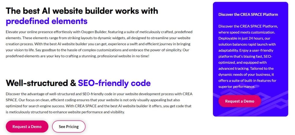
Strategic use of color in web design
Now, let’s delve into how the strategic use of color can transform a website's user experience and overall success.
Influencing brand perception
Color plays a crucial role in shaping how we perceive a brand. It’s not just about making a website look good; it’s about aligning the color scheme with the brand’s identity and message. Each color carries its own psychological associations that can reinforce or undermine the brand’s values. For instance, a brand that wants to convey luxury and sophistication might lean towards deep, rich colors like black, navy, or gold. Conversely, a brand focused on sustainability might choose greens and earthy tones to emphasize its commitment to environmental responsibility.
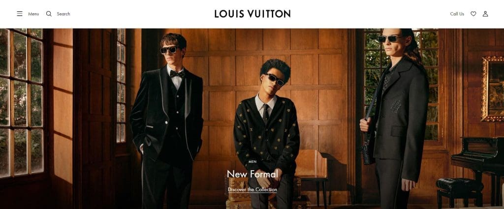
Moreover, consistency in color usage across all brand touchpoints—website, social media, advertising, and packaging—helps in building brand recognition. When users encounter a brand repeatedly in the same color scheme, they begin to associate those colors with the brand, making it more memorable and distinct in a crowded marketplace. Therefore, choosing the right colors is not just an aesthetic decision but a strategic one that can significantly impact brand perception and customer loyalty.
Understanding the target audience
Understanding the target audience is paramount when selecting a color scheme for a website. As already mentioned, color perception is not universal; it can vary widely based on factors such as culture, age, and personal experiences. Vibrant colors might appeal to a younger audience, while more muted tones could resonate better with an older demographic.

For websites with an international audience, it’s important to consider these cultural differences in color perception. A color scheme effective in one region may not work as well in another. Conducting research on the target audience's cultural background and preferences helps select colors that will resonate well, ensuring the website appeals to a global audience without unintentionally alienating any group.
Balancing color intensity
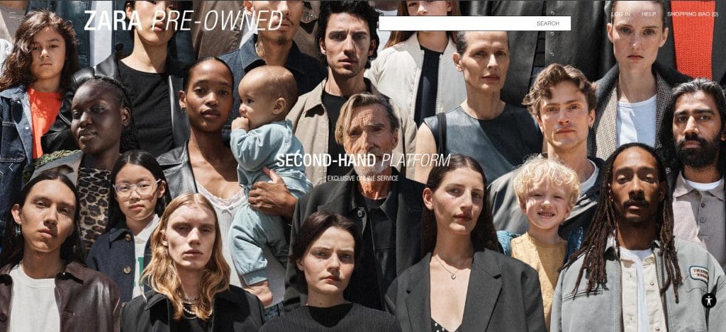
The intensity of color is another critical aspect that can make or break a website’s design. Bright, highly saturated colors can draw attention and create a sense of excitement, but if overused, they can overwhelm users and make the site difficult to navigate. On the other hand, using too many muted colors can result in a dull, uninspiring interface that fails to engage visitors.
The key is to balance color intensity to create a harmonious design. You can achieve this by using a dominant color to set the overall tone, complemented by accent colors that highlight key elements like buttons or calls to action. Additionally, incorporating neutral tones, such as whites, grays, or beiges, can help to soften the overall look and provide visual relief, making the site more pleasant to explore.
Strategic color usage helps designers sidestep issues like overly bright or dull tones, ensuring the website is visually appealing and effectively directs users to their goals.
Conclusion
The strategic use of color in web design is a multifaceted approach that involves more than just choosing aesthetically pleasing hues. It’s about understanding the psychological impact of color, aligning it with brand identity, considering the cultural nuances of the target audience, and balancing intensity to create an engaging and effective user experience. When used wisely, color can be a powerful tool that enhances user engagement, influences brand perception, and ensures that a website resonates with its intended audience.
Accessibility in color selection
The importance of accessibility in color selection
Thoughtful color selection is more than just an aesthetic choice; it's a critical component of creating a positive and inclusive user experience. Accessibility in web design is about ensuring that all users, regardless of their abilities or limitations, can engage with and understand the presented content. Color plays a vital role in this, impacting everything from readability to navigability. When designers prioritize accessibility in their color choices, they help ensure that they left behind no user, reflecting a broader commitment to diversity, equity, and inclusion.
Understanding color vision deficiencies
One of the most significant challenges in accessible web design is accounting for color vision deficiencies (CVD), commonly known as color blindness. CVD affects a substantial portion of the population, with varying degrees of severity. There are several types of color blindness, including deuteranopia (green-blind), protanopia (red-blind), and tritanopia (blue-blind). Each type affects how users perceive colors, making it crucial for designers to avoid relying on color alone to convey important information. To ensure all users understand the message, supplement the use of color to indicate errors or success states in forms with text labels or icons.
The role of contrast in accessibility
Contrast is another critical element of accessible web design, particularly for users with low vision or color blindness. High contrast between text and its background ensures that content is readable for everyone, including those with visual impairments. The Web Content Accessibility Guidelines (WCAG) provide specific criteria for color contrast, recommending a minimum contrast ratio of 4.5:1 for regular text and 3:1 for large text. Adhering to these guidelines helps designers create content that is not only visually appealing but also accessible to a broader audience.
Tools and resources for ensuring compliance
To meet accessibility standards, designers have access to a variety of tools and resources that can help them test and refine their color choices. One such tool is the Contrast Checker by WebAIM, which allows designers to input their color combinations and determine whether they meet the required contrast ratios. Other resources, like the Stark plugin for Figma, offer additional support by simulating how designs appear to users with different types of color blindness. By leveraging these tools, designers can ensure that their color choices align with accessibility best practices.
Incorporating accessibility early in the design process
The most effective way to achieve accessibility in color selection is to incorporate it from the very beginning of the design process. By considering the needs of all users from the outset, designers can avoid the costly and time-consuming task of making adjustments later on. This proactive approach not only results in a more seamless user experience but also demonstrates a commitment to inclusivity. When accessibility is treated as a core design principle rather than an afterthought, the final product is more likely to resonate with a diverse audience.
To sum up, color selection in web design is not just about creating visually striking interfaces—it's about ensuring that those interfaces are accessible to everyone. By understanding the needs of users with color vision deficiencies, adhering to contrast guidelines, and utilizing the right tools, designers can create websites that are both beautiful and inclusive. Incorporating accessibility into the design process from the beginning ensures that all users, regardless of their abilities, can enjoy and engage with web content. This approach not only fulfills ethical and legal responsibilities but also enriches the overall user experience, cultivating a more inclusive digital world.
Contemporary crazes: website color trends in 2024
Black & white: bold minimalism
In 2024, black-and-white design is making a comeback, combining simplicity with sophistication. This stark contrast creates a clean, minimalistic aesthetic that feels timeless yet modern. Black-and-white designs convey confidence and clarity, allowing content to stand out without distractions.
While black-and-white designs can be striking, there’s a risk of low readability if you don't handle the contrast well. Avoid using dark grays that can blend into the background, or bright whites that may cause eye strain. Balance between elegance and functionality is key.
Tip: Use accent colors (like gold or red) sparingly to highlight important features or buttons, ensuring clear navigation and interaction points.
Gradients: evolving vibrancy
Gradients have evolved beyond their early web design days. In 2024, designers use them more creatively, blending colors with subtlety or intensity, depending on the brand’s message. Designers are layering gradients to add depth and dimension, giving a sense of movement or fluidity.
While gradients are visually dynamic, too many layers or intense color blends can overwhelm users or make text difficult to read. Stick to subtle transitions, ensuring the gradient enhances, rather than distracts from, the overall design.
Tip: Use gradients in the background or as highlights, and pair them with simple typography to maintain a clean, professional appearance.
Pastels: soft and vibrating
Pastel shades continue to dominate in 2024, offering a soft and inviting alternative to bold, saturated colors. These light hues, like soft pinks, blues, and lavender, create a soothing atmosphere and are often associated with calmness, care, and approachability. The key is to balance pastels with bolder elements to avoid the design feeling too washed out.
Pastel colors can make your design feel gentle and inviting, but if used excessively, the site might appear washed out or lack impact. Pastels can also feel too "soft" for industries that need to convey strength or urgency, like tech or finance.
Tip: Pair pastels with stronger, contrasting colors (like navy or black) for text and important CTAs (calls-to-action) to ensure your site maintains clarity and authority.
80s revival: neon nostalgia
The nostalgia of the 80s is making a bold return to web design in 2024, featuring electric neon colors, chrome finishes, and retro aesthetics. Brands are embracing these vibrant, playful hues to create energetic and fun interfaces. The 80s revival is perfect for brands looking to add a sense of excitement and nostalgia to their designs.
But be careful! The vibrant neon and bold colors of 80s-inspired design can quickly turn from playful to chaotic if overused. Too many loud colors, flashing elements, or large typography can overwhelm visitors and make the site feel gimmicky.
Tip: Use 80s elements sparingly. Ensure that readability and usability come first, even with a nostalgic, enjoyable design.
Dark mode: easy on the eyes
This mode continues to dominate, favored for its sleek appearance and user-friendly design. Dark themes help reduce eye strain, especially in low-light environments, and allow bright elements to pop. While initially popularized by tech giants like Apple and Google, dark mode has become a go-to for websites across various industries.
While dark mode is stylish and practical, it can present issues with color contrast. Bright colors can appear too intense on dark backgrounds, and lighter shades might be difficult to distinguish. Also, dark mode can feel too serious or heavy for certain industries, like child care or wellness.
Tip: Test your design on different screen types and lighting conditions to ensure readability. Use softer, muted tones for text and ensure enough spacing between elements to maintain clarity in dark environments.
Balancing trends with brand identity
While it’s essential for designers to stay updated with these trends, it’s equally important to strike a balance between trendiness and timelessness. A website’s color scheme should not only reflect current design aesthetics but also align with the brand’s identity. A trendy color palette might attract immediate attention, but it could quickly become outdated, leaving the website looking passé. To avoid this, designers should carefully consider how to adapt current trends to suit the brand’s long-term vision.
For instance, a brand that prides itself on being cutting-edge might lean into the bold and vibrant color trend, whereas a luxury brand might opt for a more muted, classic palette that underscores its commitment to elegance and quality. It’s about finding that sweet spot where modern design meets the brand’s core message. This balance ensures that the website remains visually appealing and relevant over time without sacrificing the brand's unique identity.
Moreover, designers should also consider the psychological impact that colors have on users. While trends offer a blueprint, understanding how different colors influence emotions and behaviors is crucial for creating a user-friendly experience. For example, while dark mode may be trendy, it might not be suitable for a brand that wants to convey warmth and approachability.
In conclusion, while keeping pace with color trends in web design is important for creating contemporary websites, designers should always anchor their choices in the brand’s identity and the psychological effects of color. This way they can create websites that are not only modern and visually appealing but also timeless and aligned with the brand’s essence.
Tools and resources for choosing a color scheme
To aid in the complex task of selecting and applying colors, a range of tools and resources are available that cater to both novice and experienced designers. These tools simplify the process of creating harmonious color schemes, ensuring that the chosen palette not only looks appealing but also supports the website’s overall objectives.
Adobe Color
Adobe Color is a versatile tool that allows designers to create color schemes based on various rules, such as complementary, analogous, and triadic colors. It also offers the ability to extract a color palette from an image, which can be particularly useful when designers want to build a website around specific visuals.
Coolors
Coolors is a user-friendly tool for generating color palettes. It offers features like palette adjustments, color blindness simulation, and the ability to save and share palettes. Designers can quickly generate a color scheme by locking certain colors and letting the tool suggest complementary ones, making it easier to experiment with different combinations.
Paletton
Paletton can help create color schemes that are visually appealing and well-balanced. It’s particularly useful for beginners, with a simple interface that lets users experiment with different color harmonies. The tool also offers previews of how the color scheme will look in different settings, such as on a website or mobile app.
Color Hunt
Color Hunt is a curated collection of beautiful color palettes, updated daily. Designers can browse through a wide range of color combinations, which can serve as inspiration for their projects. It’s particularly useful for designers looking for fresh and trendy color schemes.
Material Design
This tool by Google helps designers create color schemes that align with Material Design principles. It allows users to see how different colors work together and provides suggestions for color pairings that ensure accessibility and readability, which is critical for the user experience.
ColorZilla
ColorZilla is a browser extension that provides a color picker, gradient generator, and other tools directly in the browser. This tool is especially handy for designers who need to quickly identify and use colors from web pages they find inspiring.
By utilizing these tools, designers can ensure that their color choices are both aesthetically pleasing and aligned with the psychological principles of color. This approach helps create websites that are not only visually compelling but also effectively communicate the intended message and foster the desired emotional response from users.
Successful brand color schemes: enhancing user experience and brand perception
Here, we’ll explore some case studies of successful brand color schemes that have effectively harnessed the power of color to create memorable user experiences and enhance brand perception.
1. Coca-Cola: the power of red
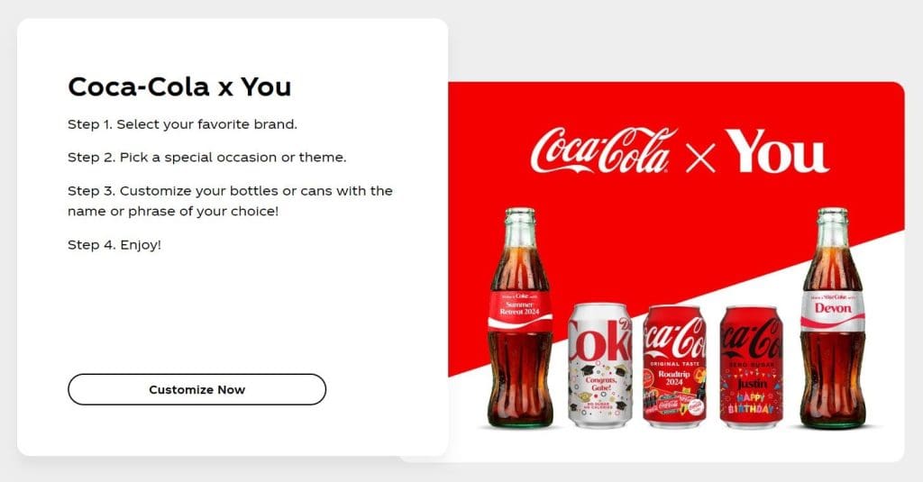
Coca-Cola's brand is synonymous with its iconic red and white color scheme. The use of red in Coca-Cola's web design is not just about brand consistency; it’s about creating an emotional connection with its audience. Red is a color often associated with energy, passion, and excitement—emotions that align perfectly with Coca-Cola’s brand values of happiness and refreshment.
On Coca-Cola’s website, the dominant use of red immediately grabs attention and invokes a sense of familiarity. The color scheme is simple but powerful, reinforcing the brand's identity at every touchpoint. The consistency of the red hue across all its digital and physical marketing materials helps in creating a cohesive brand experience. This ensures that whenever a user encounters the brand, the emotional response is immediate and strong.
2. Spotify: green for growth and creativity
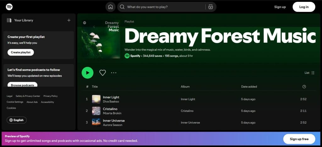
Spotify’s green color scheme is another excellent example of how color can define a brand’s identity. Green is often associated with growth, creativity, and harmony—qualities that Spotify embodies as a brand that brings music to life and cultivates discovery.
The use of green in Spotify’s web design is subtle yet effective. They primarily use green in the logo and key call-to-action buttons, providing a sense of balance and calm while also standing out against the darker backgrounds used across the site. This color choice reinforces Spotify’s brand as one that is innovative and creative, appealing to its audience's emotions and promoting a positive user experience.
3. Airbnb: welcoming pinks and warm tones
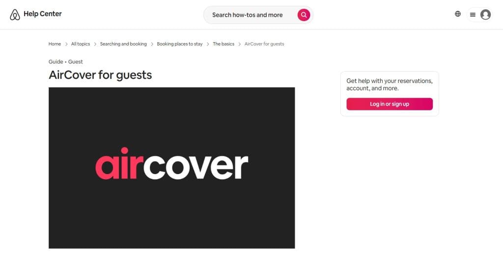
Airbnb's use of soft pinks and warm tones is a masterclass in using color to evoke feelings of comfort and belonging. The brand’s color palette is designed to make users feel at home, no matter where they are in the world. The primary shade, a warm coral pink, is inviting and friendly, helping to create a sense of trust and community—core values of the Airbnb brand.
On Airbnb’s website, these colors are used strategically to guide users through the booking process, ensuring a seamless experience. The warmth of the color scheme mirrors the welcoming nature of the brand, making users feel more comfortable and confident in their decision to book accommodations through the platform.
4. Slack: playful and productive purple
Slack, the popular communication platform, uses a vibrant purple in its branding to stand out in the crowded tech space. Purple often symbolizes creativity and wisdom, making it an ideal color for a brand that fosters communication and collaboration in the workplace.
Slack uses the purple color not only in its logo but also throughout its user interface, creating a cohesive experience that feels both professional and approachable. The use of purple helps to distinguish Slack from competitors and reinforces its brand identity as a fun and effective tool.

5. Apple: minimalist gray and white
Apple’s brand is the epitome of minimalist design; its use of neutral colors like gray and white plays a pivotal role in its web design strategy. These colors reflect Apple’s brand values of simplicity, elegance, and innovation. The clean, understated color scheme allows the products to take center stage, with the website serving as a seamless backdrop.
On Apple’s website, the neutral color palette enhances the user experience by creating a sense of calm and focus. The use of white space, paired with the subtle gray tones, makes the site effortless to navigate and the content simple to digest. This minimalist approach not only aligns with Apple’s brand aesthetic but also ensures that users can quickly find the information they need without distraction.

These case studies illustrate how the thoughtful use of color in web design can significantly impact user experience and brand perception. By aligning color choices with brand values and the emotional responses they wish to evoke, these brands have successfully created digital experiences that are both visually appealing and deeply resonant with their audiences. Whether it's through the bold use of red by Coca-Cola or the inviting pinks of Airbnb, these examples highlight the importance of color in shaping how users perceive and interact with a brand online.
Wrap-up
Do you have any more doubts about color being far more than just a visual element in web design? It’s a powerful tool that impacts every aspect of the user experience. From the moment a user lands on a webpage, color starts to work its magic, subtly influencing emotions, guiding behavior, and shaping perceptions. The multifaceted nature of color in web design means that its impact goes beyond aesthetics; it becomes a critical factor in how users interact with and respond to a website.
When used thoughtfully, color can evoke specific emotions and create a desired atmosphere. Warm colors like red and orange can stimulate excitement and urgency, making them ideal for call-to-action buttons, while cooler hues like blue and green can promote calmness and trust, perfect for brands aiming to build a sense of reliability. Understanding these psychological effects allows designers to craft experiences that resonate with users on a deeper level, driving engagement and conversion.
Moreover, color plays a crucial role in accessibility, ensuring that websites are inclusive and usable by all individuals, including those with visual impairments. By adhering to contrast guidelines and considering color blindness, designers can create interfaces that are not only visually appealing but also functionally effective for a diverse audience. This attention to inclusivity not only broadens the reach of a website but also reinforces a brand’s commitment to all users.
Staying on trend is important, but it should not come at the expense of timeless design principles. Trends in color palettes can make a brand feel contemporary and relevant, but it should apply them with caution. By balancing trendy colors with classic ones, designers can create a web experience that feels both fresh and enduring, ensuring the site remains effective and appealing over time.
