Introduction to agency web design
Welcome to the vibrant world of agency web design! This art form marries creativity with strategy to craft digital experiences that not only look stunning but also perform seamlessly. Agency web design refers to the process of designing and developing websites for businesses or other organizations; therefore, agency web design involves creating a digital platform that effectively represents an agency's brand and services. It’s more than just pretty pictures and catchy slogans; it’s about building a digital presence that resonates with your audience, enhances your brand, and drives business goals. Whether you're a startup looking to make your mark or an established company aiming to revamp your online persona, agency web design holds the key to your digital success.
The importance of first impressions
First impressions are critical in any interaction, and the digital space is no exception. The moment a user lands on your website, they form an opinion about your business, often within seconds. This initial perception can determine whether they stay and explore or leave immediately. Hence, making a positive first impression is essential for attracting and retaining visitors.
The power of aesthetics
In the digital age, aesthetics play a crucial role in making a positive first impression. Here’s why:
- Conveys professionalism: A visually appealing website indicates that your business is professional and takes itself seriously. This can be the difference between a user perceiving your business as an established entity or an amateur operation.
- Captivates and engages: High-quality design elements, such as clean layouts, attractive color schemes, and professional imagery, make your website more engaging. An aesthetically pleasing site can captivate visitors, making them more likely to explore further and interact with your content.
- Creates emotional connection: A well-designed website can evoke positive emotions, making visitors feel welcomed and valued. This emotional connection can encourage users to spend more time on your site and develop a favorable view of your brand.
Credibility
A well-designed website can enhance your business's credibility. Here’s how:
- Modern design reflects current practices: A polished, contemporary website suggests that your business is current with the latest trends and practices in your industry. This can be reassuring for visitors, as they are more likely to trust a company that appears to be on the cutting edge.
- Attention to user experience: Investing in a good design shows that you care about the user experience. Aspects such as intuitive navigation, responsive design, and accessible content demonstrate your commitment to meeting visitors' needs effectively.
- Serious branding: A sleek design communicates that your business operations are serious and reliable. This can be particularly important in competitive industries where users have numerous options and are looking for any sign that one business stands out in terms of credibility and trustworthiness.
User retention
First impressions aren’t just about attracting visitors; they’re about keeping them. Here’s why a well-designed homepage is crucial for user retention:
- Quick load times: Speed is a critical factor in user retention. If your homepage loads quickly, users are more likely to stay and explore rather than leave out of frustration. A fast-loading site enhances the user experience.
- Clear navigation: An intuitive, easy-to-use navigation system helps users find the information they need quickly and efficiently. When visitors can easily locate what they’re looking for, they are more likely to stay longer on your site and engage with more content.
- Encourages exploration: A good design not only retains users but also motivates them to explore other parts of your site. Engaging visuals, compelling content, and seamless navigation can lead users from one page to another, increasing the likelihood of conversions and repeat visits.
- Reduces bounce rates: A well-designed homepage that immediately captures attention and offers clear value propositions can significantly reduce bounce rates. Users are more likely to delve deeper into your site if they feel welcomed and find the site visually and functionally appealing.
The design of your website is a critical factor in creating a positive first impression, enhancing credibility, and retaining users. Investing in high-quality aesthetics and user experience can significantly impact your business's success in the digital space.
Understanding your audience
To create a website that truly resonates with your visitors, it is essential to understand who they are, what they need, and how they interact with online content. By gaining a deep understanding of your audience, you can tailor your website's design, content, and functionality to better serve their needs and expectations. This section will explore three key components of understanding your audience: market research, user personas, and behavioral analytics. These tools and techniques will help you build a more engaging, effective, and user-friendly website.
Market research
Market research is the foundational step in understanding your audience. It involves gathering and analyzing data about your target market and potential visitors. This process includes several methods, such as surveys, interviews, focus groups, and competitive analysis. Key elements to investigate include:
- Demographics: Age, sex, income level, education, occupation, and location. This helps in creating a profile of who your typical users are.
- Psychographics: Interests, values, attitudes, and lifestyles. Understanding these aspects helps in crafting content and visuals that resonate with your audience.
- Behavioral data: Buying habits, product usage, brand loyalty, and online activity. This information is essential for personalizing user experiences and anticipating their needs.
By thoroughly understanding these components, you can tailor your website’s design, content, and functionality to align with the expectations and preferences of your audience, leading to a more engaging and effective user experience.
User personas
User personas are semi-fictional characters based on the market research data collected. They represent different segments of your audience, each with unique traits and needs. Creating user personas involves:
- Demographic information: Age, gender, job title, income, and education level.
- Background: Career path, personal history, and daily routines.
- Goals and motivations: What are they looking to achieve when visiting your site? What drives their decisions?
- Challenges and pain points: What obstacles do they face? How can your website help them overcome these challenges?
- Behavior patterns: How do they interact with technology and make decisions online?
For instance, if your website is for a fitness product, you might have personas such as "Fitness Enthusiast Emily," who is in her 30s, loves to try new workouts, and seeks reliable fitness advice online, and "Busy Professional John," who is in his 40s, has a demanding job, and looks for efficient workout routines he can do at home. By designing with these personas in mind, you can ensure your website meets the specific needs and preferences of your diverse audience segments.
Behavioral analytics
Behavioral analytics involves tracking and analyzing the actions of visitors on your website to gain insights into their behavior. Tools like Google Analytics offer valuable data, such as:
- Traffic sources: Understanding where your visitors come from (e.g., search engines, social media, direct visits) helps in optimizing your marketing efforts.
- Page views and session duration: Identifying which pages are most popular and how long users stay on your site helps in determining what content is engaging.
- Bounce rate and exit pages: Analyzing where users drop off or leave your site can highlight problem areas that need improvement.
- User flow: Visualizing the path users take through your site reveals common navigation patterns and potential obstacles.
Using this data, you can make informed decisions to enhance the user experience. For example, if you notice a high bounce rate on a particular page, you might need to improve the content or design of that page. If users frequently visit a specific section, consider expanding it or making it more prominent.
By integrating these insights into your web design strategy, you can create a site that not only attracts visitors but also retains them by providing a seamless, intuitive, and enjoyable user experience.
Essential elements of agency web design
Creating an effective and visually appealing website for an agency involves a combination of key design principles and strategies tailored specifically for the needs of an agency. The following subsections outline essential elements that contribute to a successful agency web design.
Color theory
Emotional impact
Choose colors that align with your brand's personality and evoke the desired emotional response. For example, use calm blues for a professional, trustworthy feel, or vibrant oranges for energy and excitement. Color choices can influence user actions and perceptions. (Read more on color psychology at this site.)
Color harmony
Create a visually appealing palette by selecting colors that complement each other. For example, use analogous colors for a harmonious look or contrasting colors for a vibrant, dynamic effect. Ensure that the colors work together to enhance overall aesthetics and the user experience.
Accessibility
Ensure sufficient contrast between text and background colors to improve readability for all users, including those with visual impairments. Use tools to check contrast ratios and avoid relying solely on color to convey important information.
Typography
Font selection
Pick fonts that align with your brand's tone. For a professional look, choose clean, legible fonts. For a more creative feel, explore unique typefaces that stand out while remaining readable. The right font sets the tone and personality of the site.
Font pairing
Combine fonts thoughtfully to create visual interest and maintain readability. Pair a distinctive font for headings with a simpler font for body text to create contrast and hierarchy. Ensure that the fonts complement each other to maintain a cohesive look.
Readability and legibility
Ensure the text is easy to read by choosing appropriate sizes and spacing. Use sufficient line height and letter spacing to avoid cramped text. Structure content with headers and bullet points to improve scannability and overall readability.
Imagery
Quality
Use high-resolution images to maintain a professional appearance. Blurry or pixelated images can detract from the overall quality of the site. Optimize images to balance quality with loading speed.
Relevance
Select images that align with the content and reinforce your brand message. Avoid generic stock photos; instead, use images that add value and context to the text. Relevant images help engage users and convey the right message.
Functionality
Integrate images in ways that enhance usability, such as by using them as clickable buttons or interactive elements. Ensure images contribute to the overall functionality of the site, guiding users and providing context where needed.
Consistency
Maintain a cohesive style for all imagery across the site. Use a consistent color tone, filter, or image style to create a unified look. Consistent imagery reinforces brand identity and creates a polished, professional appearance.
User experience (UX)
Navigation
Navigation is the backbone of a website’s usability. When users arrive at a site, they need to quickly understand where they are, where they can go, and how they can find the information they need. If navigation is unclear or cumbersome, users may become frustrated and leave.
Best practices:
- Clear menus: Design menus that are easy to understand and use. Use descriptive labels for menu items rather than vague terms. For example, “Contact Us” is more intuitive than “Get in Touch.”
- Logical layout: Organize content in a way that makes sense. Group related items together and create a hierarchy that reflects user priorities. For instance, main navigation items might include “Home,” “Products,” “Services,” and “About Us.”
- Consistent design elements: Maintain consistency in navigation elements throughout the site. This includes using the same styles for buttons, links, and icons, and ensuring that navigation locations (e.g., the menu bar at the top) remain consistent across pages.
- Search functionality: Include a search bar to allow users to find specific content quickly, especially on content-heavy sites.
- Responsive design: Ensure navigation is usable on all devices, from desktops to mobile phones. This may involve designing collapsible menus or implementing touch-friendly elements.
Load time
Load time directly impacts user satisfaction and retention. A slow website can lead to user frustration, increased bounce rates, and ultimately lower conversion rates. Users expect fast, responsive websites and may abandon a site that takes too long to load.
Best practices:
- Efficient coding: Write clean, optimized code. Minimize the use of excessive scripts or complex code that can slow down page loading.
- Image compression: Optimize images for the web. Use formats like JPEG or WebP and ensure images are not larger than necessary. Implement lazy loading to load images only when they are needed.
- Caching: Use browser caching to store static resources (like CSS and JavaScript files) so that they don’t need to be reloaded on every visit. Server-side caching can also help speed up page load times.
- Content delivery network (CDN): Distribute content across various servers worldwide to reduce the distance data needs to travel and speed up load times.
- Minification: Minify CSS, JavaScript, and HTML files to reduce their size and improve load speed.
Interaction design
Interaction design focuses on how users interact with a site’s interface elements. Effective interaction design can make a site more engaging and easier to use, but poorly designed interactions can lead to confusion and frustration.
Best practices:
- Interactive elements: Design buttons, forms, and other interactive elements to be clear and easy to use. Buttons should be large enough to click easily, and forms should be simple and straightforward.
- Feedback: Provide immediate feedback for user actions. For example, a button should change color or display a loading indicator when clicked to confirm that the action is being processed.
- Consistency: Use consistent design patterns for interactive elements. For example, if you use a particular style for primary buttons, use the same style throughout the site to avoid confusing users.
- Personalization: Allow users to customize their interaction with the site according to their preferences. This might include options to change the theme or layout, which can enhance user satisfaction and engagement.
- Performance: Optimize interactive elements to ensure they work smoothly. For example, avoid overly complex animations that can cause lag or slow down the user experience.
By focusing on these aspects—navigation, load time, and interaction design—you can significantly enhance the overall user experience, making your website more user-friendly, efficient, and engaging.
Responsive design
Mobile optimization
With the surge in mobile internet usage, ensuring that your website performs well on smartphones and tablets is crucial. Mobile optimization not only improves user experience but also impacts search engine rankings, as search engines like Google use mobile-first indexing.
Key aspects:
- Touch-friendly design: Buttons and links should be large enough to be easily tapped without zooming.
- Readable text: Text should be legible without the need for zooming. Use a font size that’s easy to read on smaller screens.
- Fast load times: Mobile users often have slower internet connections. Optimize images and resources to reduce loading times.
- Viewport meta tag: This HTML tag ensures that the browser renders the page at the correct size on mobile devices.
Fluid grids
Fluid grids are a design approach where the layout of a website is created using percentage-based widths rather than fixed sizes. This allows the layout to scale proportionally, adapting to the screen size of the device.
Benefits:
- Consistency: Fluid grids provide a consistent look and feel across different devices and screen resolutions.
- Flexibility: They enable the design to adjust dynamically, which is particularly useful for handling a wide range of devices, from small smartphones to large desktop monitors.
- Adaptability: Fluid grids make it easier to design layouts that look good in both portrait and landscape orientations.
Implementation:
- Percentage-based layouts: Instead of specifying widths in pixels, use percentages to define the size of elements.
- Relative units: Combine fluid grids with relative units like ems or rems for font sizes and margins to maintain proportional scaling.
Media queries
Media queries are a CSS technique used to apply styles based on the characteristics of the device or viewport, such as its width, height, orientation, and resolution.
How they work:
- Breakpoints: Media queries use breakpoints to apply different styles at specific viewport widths. For example, you might have different styles for screens wider than 768px and narrower than 768px.
- Syntax: Media queries use the @media rule followed by conditions.
- Orientation: Media queries can also adjust for device orientation (portrait or landscape), allowing for different layouts depending on how the device is held.
Benefits:
- Enhanced user experience: Tailor the design to fit the device, ensuring that users have a good experience regardless of screen size or orientation.
- Improved performance: Load and display only the necessary styles and resources for the device being used, improving load times and performance.
Content strategy
Voice and tone
Voice and tone are crucial elements in shaping how your brand is perceived and how effectively you communicate with your audience.
- Voice: This is the consistent personality and style of your brand’s communication. It reflects your brand's core values and should remain consistent across all content. For instance, if your brand’s voice is professional and authoritative, all content should maintain that tone to build credibility and trust. Conversely, a more casual or conversational voice might be suitable for brands aiming to be approachable and relatable.
- Tone: Tone, on the other hand, can vary depending on the context and the audience. It refers to the mood or attitude conveyed in specific pieces of content. For example, while your brand might have a professional voice, the tone could shift to be more empathetic and supportive in customer service communications or more enthusiastic and energetic in promotional content.
Consistency in both voice and tone helps in building a coherent brand identity, making your content recognizable, and reinforcing your brand’s message across different channels.
Content hierarchy
Content hierarchy is about structuring information in a way that guides users through your content efficiently. A clear hierarchy helps users quickly locate and absorb the information they need.
- Headings and subheadings: Use headings to outline the main sections of your content and subheadings to break down these sections into more detailed topics. This structure not only improves readability but also enhances SEO by helping search engines understand the organization of your content.
- Bullet points and lists: These are effective for presenting key points, steps, or features in a concise manner. Lists make complex information easier to digest and help readers quickly find important details.
- Visual hierarchy: Incorporate elements like font size, color contrast, and spacing to guide the reader’s attention and emphasize important information. For example, larger, bolder text can draw attention to major headings, while smaller text or indents can denote less critical details.
By organizing content thoughtfully, you enhance the user experience, making it easier for visitors to navigate, understand, and engage with your material.
Multimedia integration
Multimedia integration involves incorporating various types of media—such as videos, images, infographics, and interactive elements—into your content strategy. This enhances engagement and can make information more accessible and memorable.
- Videos: Videos can be used to explain complex topics, showcase products, or provide dynamic storytelling. They cater to audiences who prefer visual or auditory learning and can often convey messages more effectively than text alone.
- Infographics: These visual tools simplify and present data or concepts in a visually appealing format. Infographics can help users quickly grasp complex information or trends, making your content more digestible and shareable.
- Images: High-quality images can break up text, add visual interest, and support your content. They can also help illustrate key points, evoke emotions, or enhance storytelling.
- Interactive elements: Features like quizzes, calculators, or interactive maps can engage users more deeply by involving them directly in the content. This interaction can increase the time spent on your site and improve user satisfaction.
Incorporating multimedia not only makes your content more engaging but also caters to different learning styles, increasing its overall effectiveness and shareability.
Search engine optimization (SEO)
Keyword research
Keyword research is the foundation of effective SEO. It involves identifying the words and phrases that potential visitors are using to search for content related to your site. Here’s how it works:
- Identify your goals: Determine what you want to achieve with your SEO efforts. This could be increasing traffic, generating leads, or boosting sales.
- Brainstorm seed keywords: Start with broad terms related to your business or industry. For instance, if you run a bakery, seed keywords might include “bread,” “cakes,” or “pastries.”
- Use keyword tools: Employ tools like Google Keyword Planner (first, create a Google Ads account), SEMrush, Ahrefs, or Ubersuggest to find related keywords and get data on search volume, competition, and trends.
- Analyze competitors: Look at the keywords your competitors are ranking for. This can provide insights into what works in your industry and help identify gaps you can exploit.
- Consider search intent: Understand the intent behind the keywords. Are users looking for information, trying to make a purchase, or seeking a specific service? Tailor your content to match this intent.
- Long-tail keywords: Focus on long-tail keywords (longer, more specific phrases) that are less competitive but highly targeted. For example, “checking if the site connection is secure” is more specific than just “secure connection.”
- Evaluate and refine: Regularly review your keyword performance and adjust your strategy based on changes in search trends and user behavior.
On-page SEO
On-page SEO involves optimizing individual web pages to rank higher and attract more relevant traffic. Here’s what you need to focus on:
- Title tags: The title tag is a critical SEO element that appears in search engine results and browser tabs. It should be unique, descriptive, and include primary keywords.
- Meta descriptions: Although meta descriptions don’t directly affect rankings, they can influence click-through rates. Craft compelling, keyword-rich descriptions that summarize the page content.
- Headings and subheadings: Use header tags (H1, H2, H3, etc.) to structure your content. The H1 tag should include the main keyword and clearly describe the page topic. Subheadings (H2, H3) should break down the content into sections, making it easier to read and understand.
- Content quality: Create high-quality, original content that provides value to readers. Include relevant keywords naturally, and ensure your content is comprehensive and engaging.
- Internal linking: Use internal links to connect related pages within your site. This helps distribute page authority and improves user navigation.
- URL structure: Optimize URLs to be short, descriptive, and keyword-rich. For example, use “/site-connection-secure” instead of “/post12345.”
- Images and alt text: Optimize images by using descriptive file names and alt text. This helps search engines understand the content of your images and improves accessibility.
- Mobile friendliness: Ensure your site is responsive and provides a good user experience on all devices, as mobile friendliness is a ranking factor.
Technical SEO
Technical SEO focuses on the behind-the-scenes aspects of your site that affect its visibility and performance in search engine results. Key elements include:
- Site speed: Faster-loading pages provide a better user experience and are favored by search engines. Optimize images, leverage browser caching, and use content delivery networks (CDNs) to enhance page speed.
- Mobile optimization: Ensure your site is fully functional on mobile devices. This involves responsive design and optimizing content for various screen sizes.
- XML sitemap: Create and submit an XML sitemap to search engines. This helps them understand the structure of your site and find all the important pages.
- Robots.txt: Use the robots.txt file to control which pages search engines can crawl and index. This helps manage the crawl budget and prevent the indexing of duplicate or low-value content.
- Structured data: Implement structured data (schema markup) to help search engines understand your content better and potentially enhance your listings with rich snippets.
- Fix crawl errors: Regularly check for and fix crawl errors (e.g., broken links, 404 errors) using tools like Google Search Console. These issues can hinder search engine bots from accessing your site effectively.
- HTTPS: Secure your site with HTTPS (SSL certificate). This not only protects user data but is also a ranking factor for search engines.
By focusing on keyword research, on-page SEO, and technical SEO, you can build a solid foundation for improving your site's visibility and attracting more targeted traffic.
Best practices in agency web design
User-centric design
User-centric design focuses on creating websites that prioritize the needs, preferences, and behaviors of the target audience. This approach ensures that the website is intuitive, relevant, and engaging for its users.
Best practices:
- Persona development: Develop detailed user personas based on research and data. These personas represent different segments of your audience and help guide design decisions by understanding their goals, pain points, and behaviors.
- User journey mapping: Map out the user journey to visualize the steps users take to achieve their goals on your website. This helps identify critical touchpoints and areas where the user experience can be improved.
- Content relevance: Tailor content to the needs and preferences of your target audience. Ensure that the content is valuable, engaging, and relevant to the users’ interests and needs.
- Interactive elements: Incorporate interactive elements such as forms, buttons, and calls-to-actions (CTAs) that are easy to use and strategically placed. These elements should guide users towards desired actions without causing frustration.
- Feedback mechanisms: Provide users with easy ways to offer feedback, such as surveys, feedback forms, or live chat. This direct feedback can be invaluable for ongoing improvements.
Usability testing
Usability testing involves evaluating a website by observing real users as they interact with it. The goal is to identify usability issues and gather insights on how to enhance the user experience.
Best practices:
- Define objectives: Clearly define what you want to learn from the usability tests. Objectives might include evaluating the ease of navigation, the effectiveness of CTAs, or the clarity of information.
- Recruit diverse participants: Include a representative sample of your target audience in your usability tests. This helps ensure that the feedback is relevant and covers a range of user experiences.
- Create realistic scenarios: Develop tasks and scenarios that reflect common user goals and challenges. This helps simulate real-world interactions and provides more actionable insights.
- Observe and analyze: Watch users as they complete tasks and take note of any difficulties they encounter. Analyze the data to identify patterns and areas for improvement.
- Iterate and refine: Use the insights gained from usability testing to make iterative improvements to your design. Conduct additional rounds of testing if needed to ensure that the changes are effective.
Accessibility
Accessibility in web design ensures that all users, including those with disabilities, can access and use your website. This is not only a matter of compliance with legal standards but also a commitment to inclusivity.
Best practices:
- Follow WCAG guidelines: Adhere to the Web Content Accessibility Guidelines (WCAG), which provide comprehensive criteria for making web content accessible. The guidelines cover aspects such as text alternatives, color contrast, and navigability.
- Use alt text for images: Provide descriptive alt text for all images to ensure that users who rely on screen readers can understand the content of the images.
- Ensure keyboard navigation: Design your site so that it can be fully navigated using a keyboard. This includes ensuring that all interactive elements are accessible and focusable.
- Test with assistive technologies: Use tools such as screen readers and voice recognition software to test how your site performs with these technologies. This helps identify any barriers that users with disabilities might face.
- Design for color blindness: Use color combinations that are distinguishable by users with color blindness. Avoid relying solely on color to convey important information; use text labels and patterns as well.
- Provide text alternatives for media: Include captions for videos and transcripts for audio content to ensure that users with hearing impairments can access the information.
By integrating these practices into your web design process, you can create websites that are not only effective and user-friendly but also inclusive and accessible to a broader audience.
The latest trends in agency web design
Minimalist design
Minimalist design strips away unnecessary elements to focus on what truly matters. It emphasizes clean lines, ample white space, and a limited color palette.
Key elements:
- Simplicity: By removing extraneous details, minimalist design helps users navigate and understand content more easily.
- Focus on content: With fewer distractions, the core message or content takes center stage, enhancing communication and engagement.
- Visual hierarchy: Strong use of typography and strategic placement of elements guide users' attention to the most important parts of the site.
Benefits:
- Improved load times: Fewer elements mean faster loading, which is crucial for user retention and SEO.
- Enhanced usability: Clean interfaces reduce cognitive load, making websites easier to use and navigate.
- Timeless appeal: Minimalist design tends to age well and can stay relevant longer, reducing the need for frequent redesigns.
Challenges:
- Over-simplification: Too much minimalism can lead to a lack of personality or character, making sites feel generic.
- Content prioritization: Deciding what to keep and what to remove requires careful consideration to ensure that essential information isn’t lost.
Microinteractions
Microinteractions are small, subtle animations or feedback elements that occur in response to user actions. These can include button hover effects, loading indicators, or subtle transitions.
Key elements:
- Feedback: Immediate responses to user actions (e.g., a button changing color when clicked) help users understand the result of their actions.
- Guidance: Subtle animations can guide users through tasks or inform them about the next step.
- Delight: Small animations or transitions can add a touch of personality and make interactions more enjoyable.
Benefits:
- Enhanced user experience: Feedback through microinteractions helps users feel more in control and informed about their actions.
- Increased engagement: Well-designed animations can capture attention and make the interaction more engaging and memorable.
- Improved usability: Microinteractions can provide important cues and prevent user errors by offering real-time feedback.
Challenges:
- Performance impact: Overuse of animations can slow down site performance, so it's important to balance subtlety with functionality.
- Design consistency: Microinteractions should be consistent throughout the site to avoid confusion and maintain a cohesive user experience.
Dark mode
Dark mode is a design option that uses darker colors for backgrounds and lighter text. It’s designed to reduce eye strain, especially in low-light environments.
Key elements:
- Color scheme: Dark backgrounds with contrasting light text create a visually appealing and less harsh viewing experience.
- User control: Many sites now offer dark mode as an option, allowing users to choose their preferred display settings.
- Visual impact: Dark mode can highlight certain elements and make them stand out, adding a sleek, modern look to the design.
Benefits:
- Reduced eye strain: Dark mode can be easier on the eyes in low-light conditions, reducing fatigue and discomfort.
- Battery saving: On OLED screens, dark mode can save battery life by using less power to display darker pixels.
- Aesthetic appeal: It can create a sophisticated and modern look, appealing to users who prefer a darker interface.
Challenges:
- Design challenges: Ensuring that text is readable and accessible in dark mode requires careful attention to color contrast and design choices.
- Content visibility: Some design elements or images might not translate well to dark mode, potentially impacting readability and visual appeal.
These trends reflect a broader movement towards creating more user-friendly, visually appealing, and functional web experiences. As technology and user preferences evolve, staying updated with these trends helps ensure that web designs remain relevant and effective.
Tools and technologies for agency web design
Design tools
Adobe XD
Adobe XD is a vector-based tool designed for UI/UX design. It offers tools for creating wireframes, interactive prototypes, and high-fidelity designs.
- Features: Key features include artboards for multiple screens, responsive resize options, and integration with other Adobe products. It also supports real-time collaboration and feedback through shared links.
- Use case: Ideal for designers working on complex, interactive prototypes and seeking deep integration with Adobe’s ecosystem.
Sketch
Sketch is a vector-based design tool for macOS that focuses on web and mobile UI/UX design.
- Features: It offers symbols and reusable components, making it easier to maintain consistency across designs. Sketch also has a strong plugin ecosystem, which enhances its functionality.
- Use case: Best suited for designers who prefer a dedicated macOS application with extensive plugin support and a focus on UI/UX design.
Figma
Figma is a web-based design tool that allows for real-time collaboration among team members.
- Features: It supports vector graphics and prototyping and offers features like live collaboration, comments, and version control. Being cloud-based, it facilitates easier sharing and updates.
- Use case: Perfect for teams needing real-time collaboration and version control and for designers who need accessibility from any device.
Development frameworks
React
Developed by Facebook, React is a JavaScript library used for building user interfaces, particularly single-page applications.
- Features: React uses a component-based architecture, allowing developers to create reusable UI components. It also features a virtual DOM, which enhances performance by minimizing direct manipulation of the actual DOM.
- Use case: Ideal for building complex, high-performance web applications where component reusability and efficiency are critical.
Angular
Angular, developed by Google, is a comprehensive framework for building dynamic web applications.
- Features: Angular offers a complete solution with built-in tools for data binding, dependency injection, and routing. It also provides a structured approach through its MVC (model-view-vontroller) architecture.
- Use case: Suitable for large-scale applications requiring a robust, all-in-one framework with a focus on two-way data binding and dependency injection.
Vue.js
Vue.js is a progressive JavaScript framework used for building user interfaces and single-page applications.
- Features: Vue is known for its simplicity and flexibility. It offers a reactive data binding system, a component-based architecture, and a gentle learning curve.
- Use case: Ideal for both small and large projects where developers need an easy-to-learn framework with a balance between flexibility and structure.
CMS platforms
WordPress
WordPress is a widely used content management system known for its ease of use and extensibility.
- Features: It offers a user-friendly interface, a vast library of plugins and themes, and robust customization options. WordPress is highly adaptable for various types of websites, from blogs to e-commerce.
- Use case: Best for agencies needing a versatile CMS with a large community, extensive documentation, and a broad range of plugins and themes.
Drupal
Drupal is a flexible CMS designed for complex and high-traffic websites. It offers a robust framework for managing content and user permissions.
- Features: Drupal provides advanced customization capabilities, with a focus on scalability and security. It is highly modular, allowing developers to extend its functionality through custom modules.
- Use case: Suitable for large organizations or projects requiring advanced customization, high security, and extensive content management capabilities.
Joomla
Joomla is a versatile CMS that balances ease of use with more advanced capabilities.
- Features: It offers a middle ground between WordPress and Drupal, with strong content management features, customizable templates, and extension support.
- Use case: Ideal for users needing more functionality than WordPress but less complexity than Drupal, making it suitable for a wide range of projects.
Conclusion
In summary, these tools and technologies are foundational to agency web design and development. Design tools like Adobe XD, Sketch, and Figma streamline the design process, enabling the creation of sophisticated and interactive prototypes. Development frameworks such as React, Angular, and Vue.js provide the backbone for building dynamic, high-performance web applications. CMS platforms like WordPress, Drupal, and Joomla offer robust solutions for managing and maintaining website content. Leveraging these tools effectively can greatly enhance the efficiency, functionality, and quality of web design projects.
Common pitfalls to avoid and key takeaways
Overloading with information
Problem: When users are faced with too much information, they can become overwhelmed and may struggle to find what they need. This often leads to frustration and a higher likelihood of them leaving the site or not engaging with the content fully.
Solution:
- Prioritize key information: Focus on delivering the most critical information upfront. Use headings and subheadings to break content into manageable sections.
- Use bullet points and lists: These make it easier for users to scan and digest information quickly.
- Incorporate visuals: Images, infographics, and charts can help convey complex information more simply and engagingly.
- Create a clear hierarchy: Design your content with a clear structure, starting with the most important information and drilling down into details.
- Offer summaries: For longer content, provide summaries or key takeaways at the beginning or end to help users quickly grasp the main points.
Neglecting mobile users
Problem: As already mentioned, today, a significant portion of web traffic comes from mobile devices. If a site isn’t optimized for mobile, it can lead to a poor user experience, with content that’s difficult to read or interact with.
Solution:
- Responsive design: Ensure your website uses a responsive design that adjusts its layout based on the device’s screen size. This makes your site accessible and user-friendly on all devices.
- Optimize images and media: Use scalable images and media that adjust to different screen sizes without losing quality or causing slow load times.
- Simplify navigation: Mobile users benefit from simplified navigation menus and touch-friendly elements. Avoid complex dropdowns or hover menus.
- Test on multiple devices: Regularly test your site on various mobile devices and screen sizes to ensure consistent performance and user experience.
- Ensure fast load times: Mobile users often experience slower internet speeds. Optimize your site’s performance to ensure quick load times even on slower connections.
Slow load times
Problem: A slow-loading website can frustrate users and negatively impact their experience. High bounce rates and reduced engagement often result from slow load times, as visitors may leave before the site fully loads.
Solution:
- Optimize images and videos: Compress images and videos to reduce file sizes without sacrificing quality. Use formats and resolutions appropriate for web use.
- Minimize HTTP requests: Reduce the number of elements on a page that require HTTP requests, such as scripts, stylesheets, and images.
- Leverage browser caching: Enable caching to store frequently accessed resources in users’ browsers, reducing the need for repeated downloads.
- Use content delivery networks (CDNs): CDNs distribute your content across various servers globally, speeding up load times for users regardless of their location.
- Optimize code: Minify CSS, JavaScript, and HTML files to remove unnecessary characters and whitespace. Consider asynchronous loading (aka lazy loading) for non-essential scripts.
- Monitor performance regularly: Use tools like Google PageSpeed Insights, GTmetrix, or Pingdom to regularly check your site’s performance and identify areas for improvement.
By addressing these pitfalls, you can create a more user-friendly, accessible, and engaging web experience, ultimately leading to better user retention and satisfaction.
Case studies: successful agency web designs by CREA SPACE
Case study 1: MOVIN Agency
Background: MOVIN Agency is a forward-thinking export agency specializing in sustainable wines and beverages from Central and Eastern Europe. The company needed a website that would effectively communicate its commitment to sustainability and innovation in the beverage industry.
Challenge: MOVIN required a completely new online presence that would align with their progressive brand image and effectively showcase their unique product offerings. The main challenges were to ensure visual appeal, adequately represent their sustainability efforts, and enhance user engagement.
Solution: CREA SPACE, known for its cutting-edge web solutions, was tasked with creating a website for MOVIN. We can say that we designed and developed the entire site from scratch:
- Sleek visuals: The site was given a modern, sophisticated aesthetic with high-quality imagery and a clean, minimalist design that highlighted the premium nature of the products.
- Detailed product demos: To give potential clients a more immersive experience, CREA SPACE incorporated detailed beverage profiles. This allowed users to explore product features in an engrossing manner.
- User-friendly interface: A streamlined, intuitive navigation system was implemented to enhance the overall user experience, making it easy for visitors to find information and interact with the content.
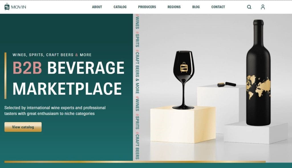
Results: The website significantly enhanced user engagement, as evidenced by metrics such as increased time spent on the site, lower bounce rates, and higher conversion rates. The site also successfully communicated MOVIN's brand values and product innovations, leading to satisfactory client acquisition and retention.
Case study 2: Peakston Kft.
Background: Founded in 1993, Peakston Kft. is a Hungarian family business specializing in modern and affordable construction auxiliary materials. As the company evolved, it sought to modernize its online presence to better showcase its product range and attract new clients.
Challenge: Peakston's existing website was outdated and did not effectively represent the quality or breadth of its product offerings. The challenge was to create a website that would appeal to both existing and potential clients while reflecting the company's reputation for high-quality and cost-effective solutions.
Solution: CREA SPACE approached the redesign with a focus on vibrant and dynamic elements to capture the essence of Peakston's innovative products:
- Bold colors: The use of striking colors helped differentiate Peakston from competitors and highlighted key areas of the site, making it visually appealing and memorable.
- Dynamic typography: To convey a modern and energetic feel, CREA SPACE used dynamic typography that varied in size and style, guiding users through the content and emphasizing important information.
- Interactive elements: The website featured interactive components such as product viewers and detailed specifications that allowed users to explore the construction materials in depth.
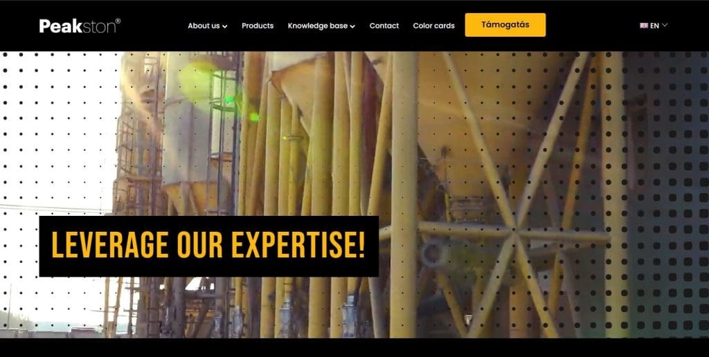
Results: The revamped website led to a notable increase in client inquiries and sales. The modern design and interactive features not only attracted more visitors but also enhanced their overall experience. The new site effectively communicated the company's commitment to quality and affordability, strengthening its market position.
Conclusion and future outlook
Conclusion
Agency web design is indeed a dynamic and multifaceted field that sits at the intersection of creativity, technical prowess, and strategic insight. The ability to craft websites that captivate users while also functioning seamlessly requires a deep understanding of various disciplines, including design principles, coding, and market trends.
1. Creativity and innovation:
- Creativity is the cornerstone of web design. It's not just about making something look aesthetically pleasing but also about creating a visual and interactive experience that resonates with users. Agencies must foster a culture of innovation, encouraging designers to experiment with new ideas and explore unconventional solutions that can set their clients apart.
2. Technical expertise:
- Technical knowledge is crucial for translating creative ideas into functional websites. This involves understanding the latest web technologies, frameworks, and best practices for coding. From responsive design to optimizing site performance and ensuring security, technical expertise ensures that the website not only looks good but works well across all devices and platforms.
3. Strategic thinking:
- Strategic thinking involves aligning web design with business goals and user needs. This means understanding the target audience, defining clear objectives, and creating a user journey that drives conversions. Agencies need to approach each project with a strategic mindset, ensuring that design decisions support broader business strategies and deliver measurable results.
Future outlook
As technology and user expectations evolve, the future of agency web design is poised for exciting developments. Here’s a dive into some of the key elements shaping the future:
1. Evolving user expectations
User expectations are evolving rapidly. Personalization is becoming a significant focus, with users increasingly expecting tailored experiences. Leveraging data analytics and artificial intelligence to create customized content and recommendations can significantly enhance user satisfaction and engagement. Additionally, immersive experiences are on the rise, with augmented reality (AR) and virtual reality (VR) technologies set to transform how users interact with websites. These technologies offer immersive and interactive experiences that go beyond traditional browsing.
2. Technological advancements
Technological advancements are also playing a crucial role in shaping the future of web design. Artificial intelligence and automation are becoming integral to the design process. AI tools can automate routine tasks such as content generation and design suggestions, allowing designers to concentrate on more strategic and creative aspects. Machine learning algorithms are also proving valuable in analyzing user behavior and optimizing site performance in real time. Progressive web apps (PWAs) are another significant advancement, providing a seamless experience by combining the best aspects of web and mobile apps. They load quickly, work offline, and offer a native app-like experience, making them increasingly popular for delivering high-quality user experiences.
3. User-centric design
User-centric design remains a core focus. Accessibility is becoming a standard requirement, ensuring that websites are usable by all individuals, including those with disabilities. This involves adhering to accessibility guidelines and designing inclusively. Usability continues to be crucial, with an emphasis on intuitive navigation, clear CTAs, and engaging content. The goal is to create websites that are easy to use and navigate, providing a positive experience for all users.
4. Leveraging tools and technologies
Finally, leveraging tools and technologies is vital. New design tools and platforms are continually emerging, offering advanced features and integrations that streamline the design process and enhance creativity. Utilizing advanced analytics tools to track user behavior and gather insights allows agencies to make data-driven decisions and continuously refine their strategies.
Embracing the journey
Navigating the continually evolving landscape of agency web design involves a commitment to learning and adaptation. Embracing new technologies, staying informed about industry trends, and recurrently improving your skills and strategies will not only keep you ahead of the curve but also help you deliver exceptional value to your clients. By focusing on these areas, you can create innovative, effective, and engaging web experiences that contribute to your clients' success and establish your company as a leader in the field.