No-code
Scalable
SEO-optimized
GDPR & CCPA ready
Lightning-fast
Secure
Easy to manage
Instant & scalable WordPress platform
An advanced, all-inclusive WordPress service, delivering high performance, optimal search engine visibility, and an exceptional user experience. Equipped with all the functionality a tech startup needs, it's ready for deployment in 24 hours. A
Get a free demoWhy to choose CREA SPACE Platform?
Discover compelling reasons to choose our WordPress platform. Designed for simplicity, it's aimed at streamlining your marketing processes.
Ready-made but completely adaptable, can be up and running in a day
The CREA SPACE Platform enables you to have a new, fully equipped marketing website operational in just 24 hours. It comes with all requisite features and integrations, ready for publishing.
Thoroughly tested and proven effective in all aspects
We've exerted considerable effort to perfect our Platform. Our emphasis lies on phenomenal site speed, top-tier SEO ranking, an intuitive user experience, and sophisticated user tracking.
Affordable entry cost, ideal for any business
Our plan-based model enables us to provide ideal solutions for businesses of all sizes. Our Light package, offering rapid 24-hour deployment with a customized user interface, is an excellent starting point for a growing business.
Lightning-fast speed
Experience a turbocharged WordPress platform like no other, designed with lightning-fast speed to make your site perform at its peak every time.
Well-ranking SEO
Achieve high-ranking SEO with our dynamic optimization tools. Watch your online visibility and site traffic soar!
Amazing user experience
Create a memorable journey for your users with our platform's intuitive interface and interactive features. A truly seamless user experience at their fingertips.
Easy to manage
Manage your digital presence effortlessly with our user-friendly platform. It's seamless, intuitive, and simplifies site control.
Auto scaling
Our platform is fully scalable, designed to grow with your needs. From small projects to large enterprises, we've got you covered.
Entirely customizable
Experience a ready-made platform that doesn't compromise on customization. Tailor the tool to fit your unique needs for a truly personalized experience.
GDPR & CCPA ready
Experience full GDPR and CCPA compliance with integrated cookie popups, prepared policies, and seamless GDPR-compatible integrations.
Fully secure
Our platform ensures top-tier security. Keep your data secured and protected with our state-of-the-art cybersecurity measures.
A blazing fast WordPress platform
Experience lightning-fast performance like never before with our WordPress platform. Check out the rapid speed index of these three client websites and witness how we accelerate their digital success!
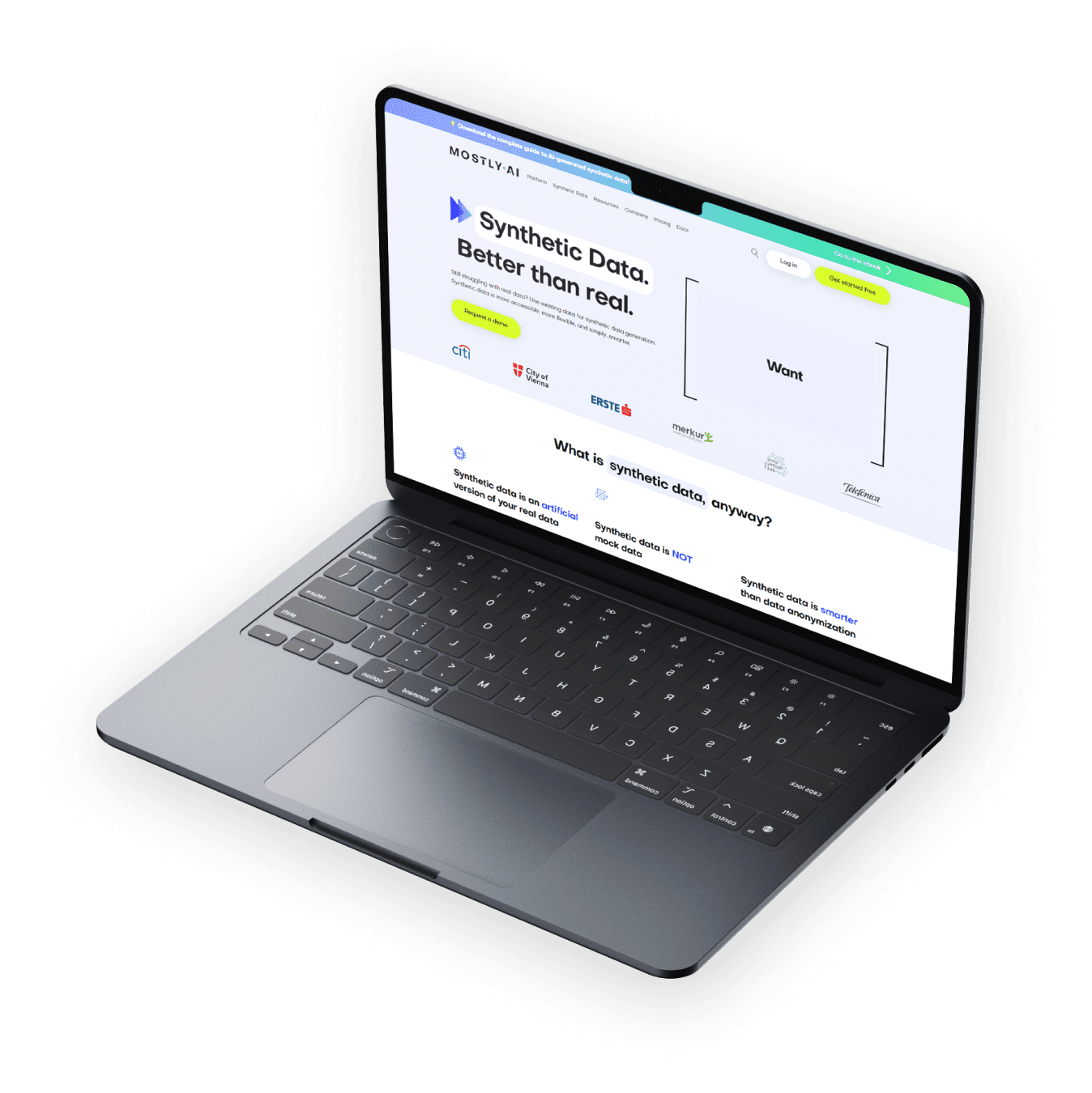
MOSTLY AI
mostly.ai
0
Mobile
(%)
0
Desktop
(%)
0,33
Load time
(second)
A
Performance
100%
Structure
90%
Load time
0.33s
Measure now
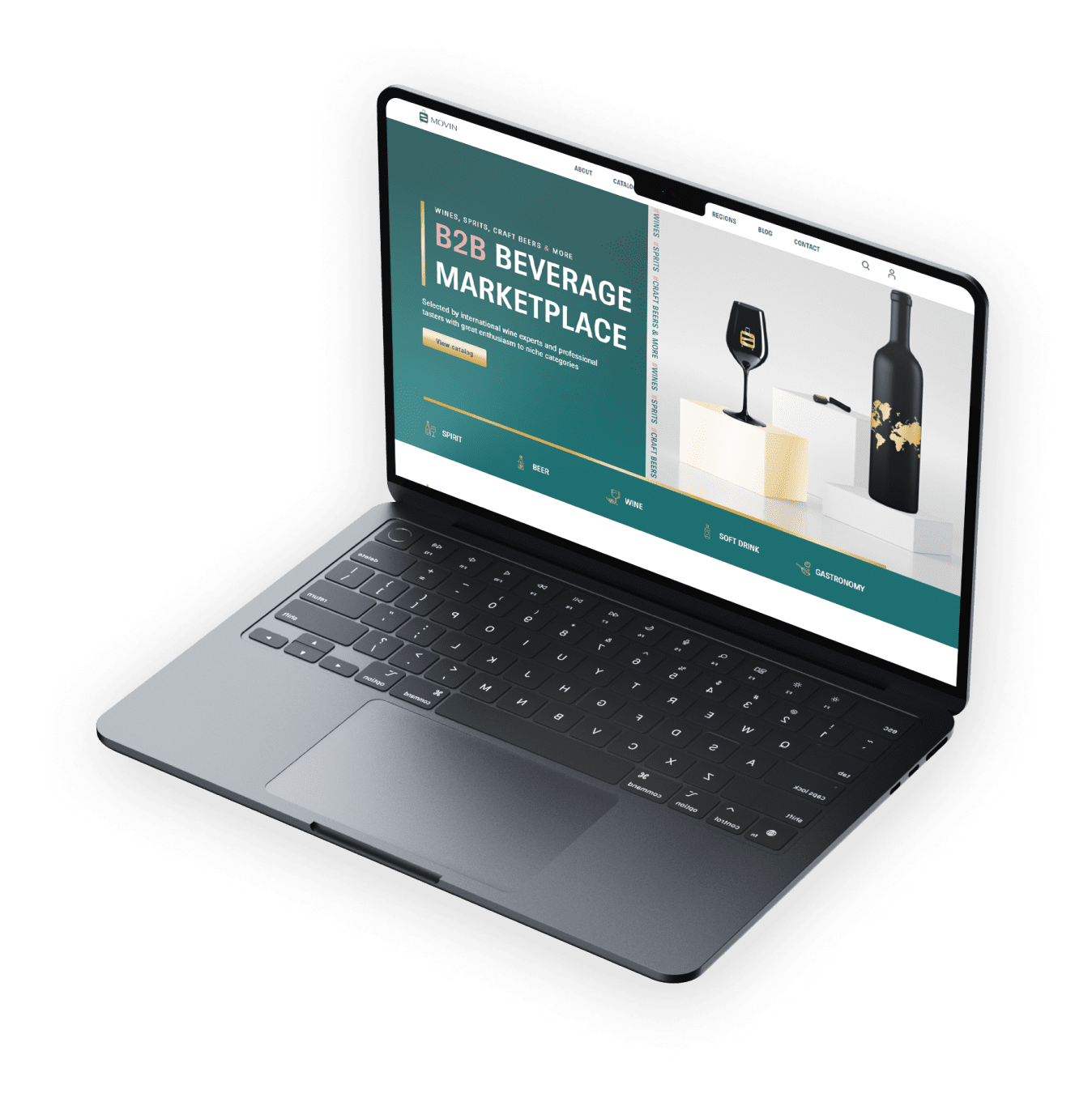
MOVINAGENCY
movinagency.com
0
Mobile
(%)
0
Desktop
(%)
0,31
Load time
(second)
A
Performance
100%
Structure
99%
Load time
0.22s
Measure now
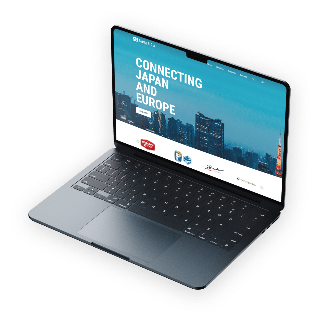
SŰDY & Co.
sudy.co.hu
0
Mobile
(%)
0
Desktop
(%)
0,22
Load time
(second)
A
Performance
100%
Structure
99%
Load time
0.22s
Measure now
Powered by Google Lighthouse
Features of our WordPress platform
Discover our cutting-edge WordPress platform, created to simplify your marketing process.
A visually intuitive, professional website builder
Create with a visually intuitive, professional builder. Use OXIA AI to generate, optimize or translate text content.
WordPress website analytics with advanced user tracking
Integrated Mixpanel for advanced WordPress user tracking gains deep insights into behavior.
YouTube channel syncronization with AI transcript generation
Automatic YouTube channel syncronization with AI transcript generation for better SEO.
Trackable, visual PDF document builder for case studies and eBooks
Generate and publish trackable case studies or eBooks from within your WordPress using the visual PDF builder.
Enhanced website content with built-in AI copywriting and optimization tools
Write, fix, modify or translate your website content without leaving the platform.
Effortless blogging & seamless news publishing
Engage and grow your audience with blogging tools, craft impactful and compelling content effortlessly!
Client testimonials
Explore how our tailored solutions have empowered others to navigate challenges, seize opportunities, and chart a course towards sustainable success.
"Wow, I'm beyond impressed! You guys are absolute superstars!"
Sarah Johnson
Chief Marketing Officer - Tech Innovations Inc.
"thank you so much for all this - you guys are total Rockstars"
Lily Melnyk
VP Global Marketing – MOSTLY AI